Compare crypto groups
The question: “Was this a group-wide move, or was the average carried by a few assets?”
A cohort is a group of assets. Open Cohorts to choose groups and explore them on the same timeline.
Intro lesson on the Cohorts page
The Cohorts workspace includes an inline introductory lesson (eight chapters, about four minutes). It walks through choosing groups, equal weighting, performance, relative performance, contributions, overlap, replay and opening a member ticker.
It is an introduction. It does not cover every Relationships, filter or correlation control — the sections on this page take you through those. Start the lesson from the Cohorts workspace.
1. Define the comparison
Choose Group A, Group B, a Benchmark and 24H, 7D or 30D history. For a first comparison, try decentralised-finance assets against artificial-intelligence-related assets with Bitcoin as the benchmark. Use the actual category names offered in the selectors.
A and B are labels, not ratings. Neither group is the “good” or “bad” one. An asset appears in A or B because it belongs to the category you selected; it can belong to both.
The chart uses current category membership to examine the chosen history. It is not a backtest of which assets belonged to the group at every historical date.
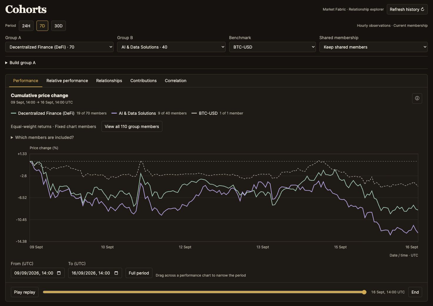
Captured 16 September 2026; the selected history is 9–16 September. This is a static example.
2. Choose what happens to shared assets
| Shared membership | Effect | Useful for |
|---|---|---|
| Keep shared members | Assets in both categories participate in both groups | Comparing the categories as defined |
| Exclude shared members | Shared assets leave both groups | Separating the two categories more clearly |
| Shared members only | Both groups are restricted to the intersection | Investigating the assets that connect the themes |
Two lines can resemble each other partly because they include the same assets. Check overlap before interpreting that similarity. In shared-only mode, identical membership can legitimately produce identical performance lines.
3. Match the chart to the question
| View | What it helps you see | How to use it |
|---|---|---|
| Performance | The groups' price journeys across the same selection | Compare their paths and the benchmark, not only the last point |
| Relative | Whether a group did better or worse than the benchmark | Read the relative difference; outperforming does not necessarily mean a positive absolute return |
| Contributions | Which members account for the group's return | Choose A or B; bars show the largest 16 absolute contributions in percentage points |
| Relationships | How two readings vary across individual assets | Choose the horizontal and vertical metrics; inspect points or drag a box to select members |
| Correlation | Whether selected return series moved together through time | Choose a supported pair and window; read it as historical co-movement, not a forecast |
Contributions are not the same as a list of the highest token returns. They describe each member's contribution under the comparison's weighting. The member table lets you inspect the assets behind the chart.
See Relationships and Contributions
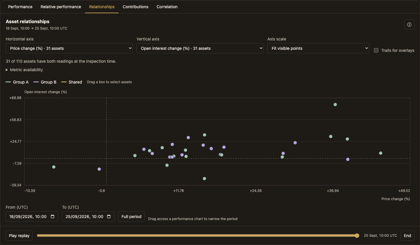
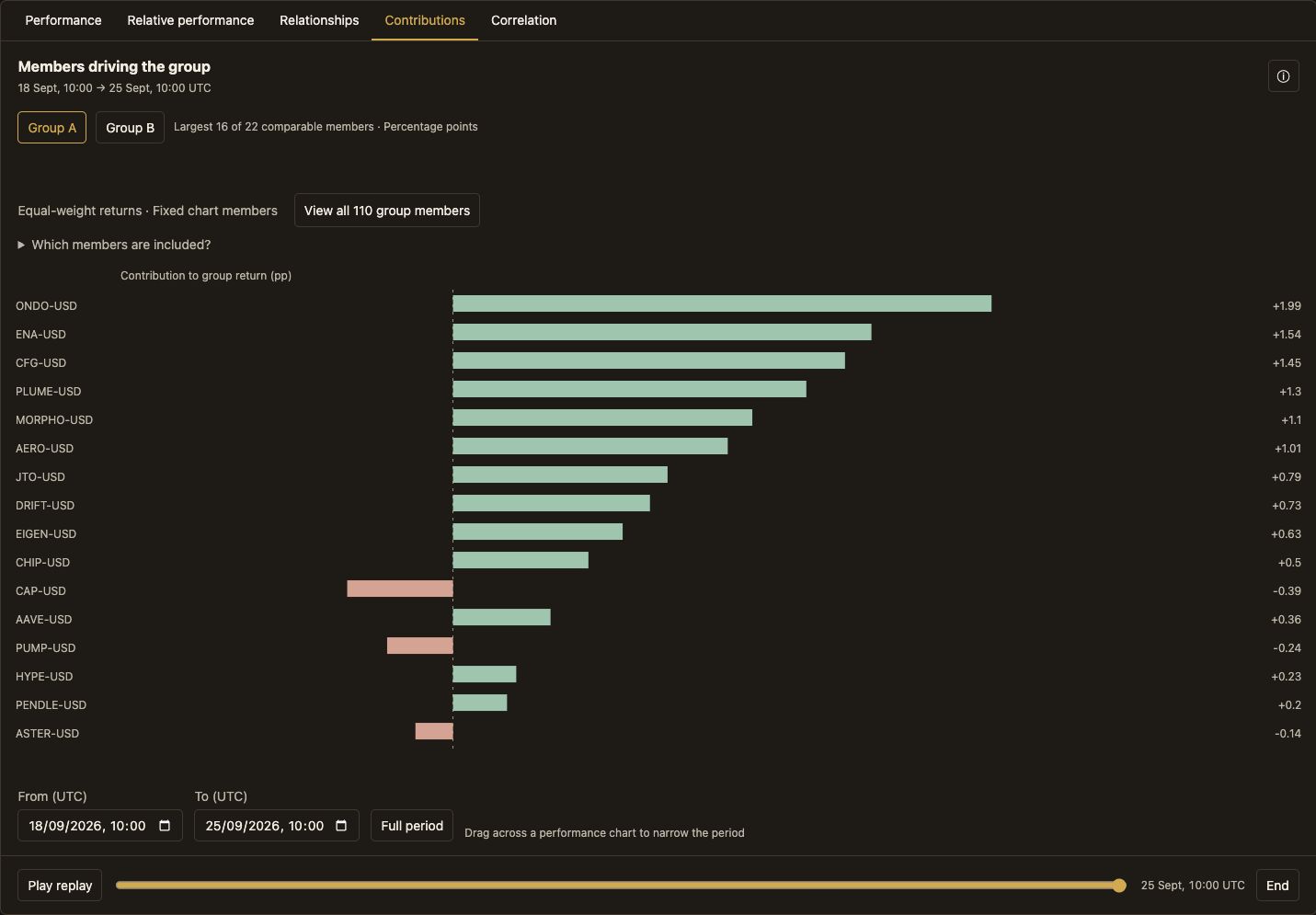
Research Desk (browser) captures, 25 September 2026; selected history 18–25 September 10:00 UTC. These are static examples, not MCP widget renders or live quotes.
4. Refine Group A
Open Build group A to add metric limits or select a custom set of assets. The builder and its numeric filters change A only; B remains the comparison group. Availability counts show how many A members have that metric before filtering.
In Relationships, a box selection highlights points. Applying that selection as a group is a separate action. You can also exclude selected assets or add them as overlays. An overlay is a reference line; it does not add the asset to either group's membership.
Change one control at a time if you want to understand what changed the result.
5. Explore when the difference emerged
Use From (UTC) and To (UTC), or drag across a performance chart, to narrow the selection. Full period restores the loaded history's bounds.
Play replay progressively reveals loaded line history. Axes, legend and member table stay stable; the table has its own reading time and does not become a frame-by-frame trading feed. The scrubber lets you inspect a point and End returns to the end. Snapshot-based views can request the selected inspection frame.
Refresh history retrieves a new prepared history while preserving valid choices. Replay and refresh are different actions.
6. Check which members are represented
The legend shows charted members versus category membership. Chart members focuses the table on assets in the chart; All members also identifies those not included. Price times reveals the observations used for an asset's comparison.
The tracked market is the platform's configured universe, not every crypto asset. Sources and gaps are explained in How the readings work.
A useful sequence: Performance → Relative → Contributions → inspect an unusual member in its ticker workspace. Use Relationships when you have a specific pair of metrics to explore.