Compare crypto cohorts
A cohort is a named group of assets. Group A and Group B are your chosen comparison groups, not ratings or recommendations. An asset can belong to both.
Compare decentralised-finance tokens with artificial-intelligence-related tokens over seven days, using Bitcoin as a benchmark.
The assistant first resolves the actual category names and membership. It prepares a common history, then compares both groups over the same selected period.
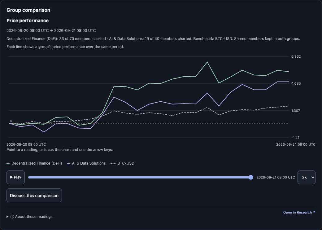
Example captured 25 September 2026, rendered from the current released bundle using the verified 21 September 2026 real result (retained, not a fresh 25 September read): DeFi 33 of 70 and AI & Data Solutions 19 of 40 members charted over 2026-09-20 08:00 → 2026-09-21 08:00 UTC. These historical readings are not live quotes.
Choose the chart for the question
| Question | Chart |
|---|---|
| Which group rose more over this selection? | Performance |
| Did the group outperform Bitcoin? | Benchmark-relative performance |
| Was the result carried by a few assets? | Member contributions |
| Did assets with larger returns also have larger open-interest changes? | Relationships, with the two metrics named on the axes |
| Did assets move together through time? | Correlation, only where comparable observations support it |
A group-average line alone does not show whether most members participated. Open contributions or member evidence before drawing that conclusion.
The browser Cohorts walkthrough links the approved inline intro lesson, shows dated Relationships and Contributions captures, and explains the five views, the overlap controls and the member table.
Refine without changing the question
Try:
- “Exclude assets shared by the two groups.”
- “Keep the groups and dates; switch the benchmark to the tracked market.”
- “Overlay ETH without adding it to either group.”
- “Filter Group A by this metric, keeping Group B unchanged.”
Keep shared assets includes them in both groups; exclude shared removes them from both; shared only isolates their intersection. An overlay is a reference line, not a membership change.
The comparison uses a pinned history snapshot so control changes remain comparable. Local replay changes what is revealed, not the underlying observations.
The current builder filters and custom membership apply to Group A. Group B remains the selected comparison group. Category membership is current, even when the price history covers earlier dates. Ask the assistant to name the membership, weighting, selected dates and benchmark before interpreting a difference.
Why switch views? If A outperforms B, Contributions helps distinguish a broadly shared result from one dominated by a few members. Relationships helps investigate a specific pair of readings across assets. Correlation asks a different question: how two return series moved together through time.
Step-by-step browser controls · Plain-English terms
Tools: research_prepare_cohorts → research_cohort_status when needed → research_compare_cohorts → research_show_cohorts. The assistant should reuse the same snapshot for refinements.
In the focused widget the view comes from the request — price performance, versus benchmark, contributions, metric relationships or pair correlation. Contributions shows the largest eight members (the Research browser shows sixteen), and relationships exposes both metric axes and the axis scale. The Cohorts widget guide covers those controls.