Focused research widgets
Each widget answers one question. Ask for the view you need, then refine the asset, dates or comparison in chat. Use the chart to inspect the result and the conversation to ask what it means.
New here? Connect Claude or ChatGPT. You do not need to memorise the tool names in the technical reference.
See the widgets
These are actual MCP widgets with captured market data, shown as static examples rather than live quotes; each figure gives its capture date and selection. Your assistant's surrounding appearance may differ. Select an image to view it at full size.
Every widget image across these guides comes from the released MCP bundles with real captured market data, rendered in a local preview harness. They are not native Claude/ChatGPT acceptance tests.
Two practical notes: Get a fresh read is inside About these readings on each widget; clicking a screenshot here enlarges the static image rather than opening the live widget; and local controls such as replay, the hour slider or axis selectors change only what is displayed, never the captured source data.
Price and replay
Show seven days of Bitcoin with hourly candles.
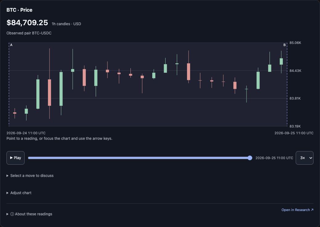
Captured 25 September 2026: BTC · Price, 1-hour candles, 2026-09-24 11:00 → 2026-09-25 11:00 UTC.
The candles show the path between the endpoints. In the working widget, Play reveals that history and Select a move to discuss lets you focus the next question. Try the investigation.
Group comparison
Compare decentralised finance with AI-related crypto assets over seven days, using Bitcoin as the benchmark.
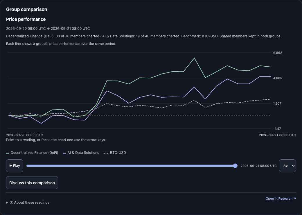
Captured 25 September 2026, rendered from the current released bundle using the verified 21 September 2026 real result (retained, not a fresh 25 September read): DeFi 33 of 70 and AI & Data Solutions 19 of 40 members charted over 2026-09-20 08:00 → 2026-09-21 08:00 UTC.
The legend names the groups and reference. Ask for the view you want — price performance, versus benchmark, contributions, metric relationships or pair correlation. The focused widget has no generic chart selector; the cohorts widget guide explains each view.
Funding
Show Bitcoin funding over the same period. What does it add to the picture?
Funding adds the carrying cost of perpetual-futures exposure. A separate view keeps its units distinct from price: funding stays a rate per eight hours, even when the chart uses daily candles. Understand the reading.
Market regime and volatility
Show the market regime and volatility context for Ethereum over the last seven days.
This combined panel describes observed hourly variation: a volatility chart measured on 4-hour, 1-day and 7-day horizons, a regime strip naming the frozen model state for each hour, and a shared Inspect hour ending slider. The context clock stays hourly when you change price-candle intervals. Read the combined guide, which includes dated Research Desk captures of the panel, its selected-hour change and the released legend.
All 14 widgets
Each family has its own guide below the table.
| Widget | What you can explore | Try asking |
|---|---|---|
| Market shortlist | The published market-board order and available readings | “Show the first five assets on the market board.” |
| Asset directory | Covered tickers and category membership | “Which assets belong to artificial intelligence?” |
| Price | Candlesticks over an explicit range, with replay | “Show seven days of Bitcoin with hourly candles.” |
| Market regime and volatility | Observed hourly variation, its historical percentile and the frozen regime state | “Show the market regime and volatility context for Bitcoin over the last seven days.” |
| Funding | The cost of holding perpetual-futures exposure | “Show Bitcoin funding over that same period.” |
| Open interest | Reported open positions by venue, in the returned units | “How did open interest change during that move?” |
| Liquidations | Retained long- and short-liquidation flows | “Show liquidations alongside that sell-off.” |
| Liquidity | Quoted spreads and displayed order-book depth | “Did the quoted spread widen during the move?” |
| Positioning | Available account or tracked-cohort positioning | “Show the available long/short positioning for this asset.” |
| Study | One available indicator calculated on the selected candle interval | “Show RSI 14 for that range and explain what it measures.” |
| Cohorts | Group performance, relative performance, contributions and relationships | “Compare DeFi with artificial-intelligence assets over seven days.” |
| Market Update | The latest published show and its chapters | “Open the latest Market Update.” |
| Video timeline | Ticker-primary chapters within a publication window | “Show Bitcoin videos published in the last seven days.” |
| News context | Linked stories and daily topic attention | “Show the news context for Bitcoin on 14 September 2026.” |
Studies are normally calculated on the selected supported candle interval (1h, 4h or 1d), with the required earlier history used for warm-up. An explicitly requested native study is the exception: it keeps its stored source clock and is never substituted for an unavailable candle study.
Interacting with a chart
For price, inspect individual candles, use Play to reveal the path and select a move to discuss with the assistant. A follow-up should keep your chosen asset and dates unless you ask to change them. If a response changes the selection, ask the assistant to restore it before comparing numbers.
Replay reveals the captured observations progressively. It does not stream new market data or change the underlying sample. Expanding a chart gives it more room when the host supports expansion.
Ask the assistant to change the dates or fetch a different metric. That is a new data request. Moving through an existing chart or changing a supported local view reuses its evidence.
For cohorts, Group A and Group B are the groups you choose—not recommendations or “good” and “bad” assets. You can inspect membership, change the treatment of shared members and compare against a benchmark. See Explore cohorts.
A useful follow-up adds a question
After a price chart, ask “Did funding change sides during this move?” rather than just “more analysis”. After a cohort performance chart, ask “Which members account for the difference?” to move to contributions. After a Market Update chapter, ask “Show that asset's price since publication” to distinguish the historical report from later observations.
Your assistant may retrieve several metrics, but they remain focused views with their own units and sources. Read the glossary for what each adds, or the prompt walkthroughs for a complete investigation.
Evidence first, display second
The assistant retrieves data, then calls the matching display tool with the returned evidence ID. A widget renders that captured result; it does not accept invented prices or independently generate analysis.
There are 14 widgets and 28 tools: 14 retrieval/analysis/help tools plus 14 display tools. Some tools—such as range interpretation and workflow help—return evidence without adding another widget. See the tool reference.
See the same readings in Research Desk
The browser workspace shows these readings with more room and direct chart controls. These are Research Desk (browser) captures, not MCP widget renders:
- Market regime and volatility — the panel with the latest hour selected, the earlier hour that changes both values and state, and the exact released legend.
- Cohort Relationships and Contributions — the 18–25 September window, 31 of 110 qualifying pairs and the largest 16 of 22 comparable members.
- Derivatives and L2 liquidity — cross-exchange open interest and funding plus one-hour liquidations, with the Coinbase Advanced spot BTC-USDC L2 panel captioned with its “History partially loaded” limit.
- The chart’s indicator library — studies calculated from the chart’s 1h candles with earlier history for warm-up.
Host support controls whether an embedded widget, expansion or playback is available. Source links and an Open in Research link provide a route to the browser product. That link opens the relevant asset or section; it is not a promise to recreate every local chart setting.
Reading the result
Units and timestamps matter. Studies are calculated on the selected candle interval (1h, 4h or 1d) with earlier history for warm-up; only an explicitly requested native study keeps its own stored source clock. A source gap remains a gap, not a zero. Open the reading details when you need to inspect provenance.
The assistant can discuss what these observations mean, but its interpretation is separate from the captured numbers. How the readings work explains the distinctions.